Box
Overview
The box insight type is used to display data as a box plot, which shows the distribution of data based on quartiles, medians, and potential outliers. It's useful for statistical visualizations, as it highlights data spread and central tendency while accounting for variability.
You can control various aspects of the plot, such as orientation, box and whisker styles, marker symbols, and points display. Additionally, you can show or hide outliers and configure hover labels for enhanced interaction.
Common Uses
- Distribution Analysis: Understanding the distribution of quest-related data.
- Outlier Detection: Identifying outliers in quest performance metrics.
- Comparative Analysis: Comparing the performance of knights on different quests.
See the Attributes for the full set of configuration options.
Examples
Common Configurations
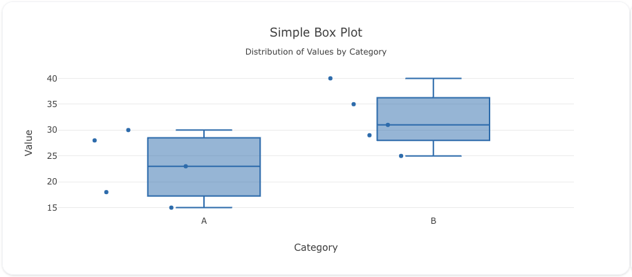
Here's a simple box plot showing the distribution of sample data:
sources:
  - name: sample-data-source
    type: duckdb
    database: target/seeds/sample_data.duckdb
    seeds:
      - table_name: model
        args:
          - echo
          - |
            category,value
            A,23
            A,15
            A,18
            A,30
            A,28
            B,40
            B,35
            B,31
            B,25
            B,29

models:
  - name: sample-data
    source: ${ref(sample-data-source)}
    sql: select * from model
insights:
  - name: Sample Box Plot
    props:
      type: box
      x: ?{${ref(sample-data).category}}
      y: ?{${ref(sample-data).value}}
      boxpoints: "all"
      jitter: 1
      pointpos: -1.1

charts:
  - name: Simple Box Plot Chart
    insights:
      - ${ref(Sample Box Plot)}
    layout:
      title:
        text: Simple Box Plot<br><sub>Distribution of Values by Category</sub>
      xaxis:
        title:
          text: "Category"
      yaxis:
        title:
          text: "Value"
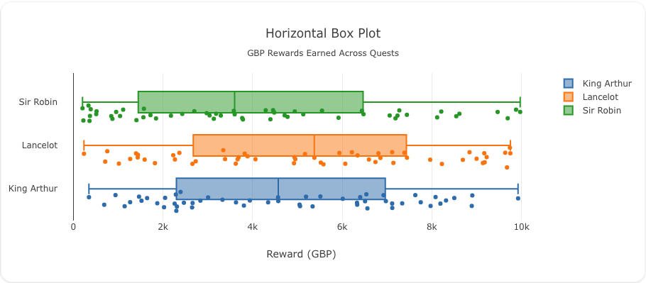
Here's a box plot showing the distribution of rewards earned by knights across different quests:
sources:
  - name: quest-rewards-source
    type: duckdb
    database: target/seeds/quest_rewards.duckdb
    seeds:
      - table_name: model
        args:
          - curl
          - "https://raw.githubusercontent.com/visivo-io/data/refs/heads/main/monty_python_quests.csv"

models:
  - name: quest-rewards
    source: ${ref(quest-rewards-source)}
    sql: select * from model
insights:
  - name: Rewards Distribution by Quest
    props:
      type: box
      y: ?{${ref(quest-rewards).person}}
      x: ?{${ref(quest-rewards).reward_gbp}}
      boxpoints: "all"
      jitter: 1
      pointpos: -1.1
      orientation: h

charts:
  - name: Rewards Box Plot Chart
    insights:
      - ${ref(Rewards Distribution by Quest)}
    layout:
      title:
        text: Horizontal Box Plot<br><sub>GBP Rewards Earned Across Quests</sub>
      xaxis:
        title:
          text: "Reward (GBP)"
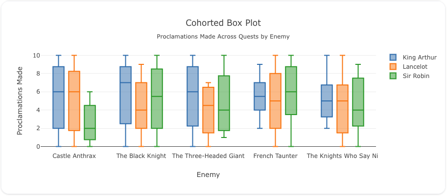
In this example, we show how to display a box plot for the number of proclamations made across quests, split by person:
sources:
  - name: proclamations-data-source
    type: duckdb
    database: target/seeds/proclamations_data.duckdb
    seeds:
      - table_name: model
        args:
          - curl
          - "https://raw.githubusercontent.com/visivo-io/data/refs/heads/main/monty_python_quests.csv"

models:
  - name: proclamations-data
    source: ${ref(proclamations-data-source)}
    sql: select * from model
insights:
  - name: Proclamations Box Plot
    props:
      type: box
      y: ?{${ref(proclamations-data).proclamations_made}}
      x: ?{${ref(proclamations-data).enemy_encountered}}
    interactions:
      - split: ?{${ref(proclamations-data).person}}

charts:
  - name: Proclamations Box Plot Chart
    insights:
      - ${ref(Proclamations Box Plot)}
    layout:
      title:
        text: Cohorted Box Plot<br><sub>Proclamations Made Across Quests by Enemy</sub>
      xaxis:
        title:
          text: "Enemy"
      yaxis:
        title:
          text: "Proclamations Made"
      boxmode: group