Shapes and Annotations
Introduction
Shapes and annotations are powerful tools in Visivo to enhance your visualizations by adding context, emphasis, and interactivity.
TLDR
Shapes enable you to highlight regions and set thresholds/targets, while annotations help add explanatory notes or call attention to specific data points.
Checkout the live examples dashboard. It brings to life the examples below.
Both shapes and annotations are configured through the layout property of charts.
This guide explains how to use shapes and annotations in Visivo, including practical examples you can copy and paste into your projects.
What are Shapes?
Shapes in Visivo allow you to draw graphical elements like lines, rectangles, and circles on your visualization. They can be used to highlight regions, denote thresholds, or emphasize trends.
Use Cases
- Highlight a time period in a time series chart
- Mark a threshold or limit with a line
- Show regions of interest in scatter plots
What are Annotations?
Annotations provide a way to add textual notes or labels to your visualizations. They can point to specific data points or regions, often with optional arrows for emphasis.
Use Cases
- Add explanatory text to a chart
- Emphasize outliers or anomalies
- Provide detailed tooltips for better data understanding
Configuration Syntax
Shapes and annotations are defined in your chart.layout properties.
Shapes
Example
shapes:
 - type: rectangle
    x0: 10
    x1: 20
    y0: 5
    y1: 15
    line:
      color: red
      width: 2
    fillcolor: rgba(255, 0, 0, 0.2)
Configuration
shapes:
  editable: 'boolean' # (1)!
  fillcolor: 'color' # (2)!
  fillrule: 'enumerated , one of ( "evenodd" | "nonzero" )' # (3)!
  layer: 'enumerated , one of ( "below" | "above" )' # (4)!
  line:
    color: 'color' # (5)!
    dash: 'string' # (6)!
    width: 'number greater than or equal to 0' #(7)!
  name: 'string' #(8)!
  opacity: 'number between or equal to 0 and 1' #(9)!
  path: 'string' #(10)!
  templateitemname: 'string' #(11)!
  type: 'enumerated , one of ( "circle" | "rect" | "path" | "line" )' #(12)!
  visible: 'boolean' #(13)!
  x0: 'number or categorical coordinate string' #(14)!
  x1: 'number or categorical coordinate string' #(15)!
  xanchor: 'number or categorical coordinate string' #(16)!
  xref: 'enumerated , one of ( "paper" | "/^x([2-9]|[1-9][0-9]+)?( domain)?$/" )' #(17)!
  xsizemode: 'enumerated , one of ( "scaled" | "pixel" )' #(18)!
  y0: 'number or categorical coordinate string' #(19)!
  y1: 'number or categorical coordinate string' #(20)!
  yanchor: 'number or categorical coordinate string' #(21)!
  yref: 'enumerated , one of ( "paper" | "/^y([2-9]|[1-9][0-9]+)?( domain)?$/" )' #(22)!
  ysizemode: 'enumerated , one of ( "scaled" | "pixel" )' #(23)!
- Determines whether the shape could be activated for edit or not. Has no effect when the older editable shapes mode is enabled via
config.editableorconfig.edits.shapePosition. - Sets the color filling the shape's interior. Only applies to closed shapes.
- Determines which regions of complex paths constitute the interior. For more info please visit https://developer.mozilla.org/en-US/docs/Web/SVG/Attribute/fill-rule
- Specifies whether shapes are drawn below or above traces.
- Sets the line color.
- Sets the dash style of lines. Set to a dash type string ("solid", "dot", "dash", "longdash", "dashdot", or "longdashdot") or a dash length list in px (eg "5px,10px,2px,2px").
- Sets the line width (in px).
- When used in a template, named items are created in the output figure in addition to any items the figure already has in this array. You can modify these items in the output figure by making your own item with
templateitemnamematching thisnamealongside your modifications (includingvisible: falseorenabled: falseto hide it). Has no effect outside of a template. - Sets the opacity of the shape.
- For
type"path" - a valid SVG path with the pixel values replaced by data values inxsizemode/ysizemodebeing "scaled" and taken unmodified as pixels relative toxanchorandyanchorin case of "pixel" size mode. There are a few restrictions / quirks only absolute instructions, not relative. So the allowed segments are: M, L, H, V, Q, C, T, S, and Z arcs (A) are not allowed because radius rx and ry are relative. In the future we could consider supporting relative commands, but we would have to decide on how to handle date and log axes. Note that even as is, Q and C Bezier paths that are smooth on linear axes may not be smooth on log, and vice versa. no chained "polybezier" commands - specify the segment type for each one. On category axes, values are numbers scaled to the serial numbers of categories because using the categories themselves there would be no way to describe fractional positions On data axes: because space and T are both normal components of path strings, we can't use either to separate date from time parts. Therefore we'll use underscore for this purpose: 2015-02-21_13:45:56.789 - Used to refer to a named item in this array in the template. Named items from the template will be created even without a matching item in the input figure, but you can modify one by making an item with
templateitemnamematching itsname, alongside your modifications (includingvisible: falseorenabled: falseto hide it). If there is no template or no matching item, this item will be hidden unless you explicitly show it withvisible: true. - Specifies the shape type to be drawn. If "line", a line is drawn from (
x0,y0) to (x1,y1) with respect to the axes' sizing mode. If "circle", a circle is drawn from ((x0+x1)/2, (y0+y1)/2)) with radius (|(x0+x1)/2 -x0|, |(y0+y1)/2 -y0)|) with respect to the axes' sizing mode. If "rect", a rectangle is drawn linking (x0,y0), (x1,y0), (x1,y1), (x0,y1), (x0,y0) with respect to the axes' sizing mode. If "path", draw a custom SVG path usingpath. with respect to the axes' sizing mode. - Determines whether or not this shape is visible.
- Sets the shape's starting x position. See
typeandxsizemodefor more info. - Sets the shape's end x position. See
typeandxsizemodefor more info. - Only relevant in conjunction with
xsizemodeset to "pixel". Specifies the anchor point on the x axis to whichx0,x1and x coordinates withinpathare relative to. E.g. useful to attach a pixel sized shape to a certain data value. No effect whenxsizemodenot set to "pixel". - Sets the shape's x coordinate axis. If set to a x axis id (e.g. "x" or "x2"), the
xposition refers to a x coordinate. If set to "paper", thexposition refers to the distance from the left of the plotting area in normalized coordinates where "0" ("1") corresponds to the left (right). If set to a x axis ID followed by "domain" (separated by a space), the position behaves like for "paper", but refers to the distance in fractions of the domain length from the left of the domain of that axis: e.g., "x2 domain" refers to the domain of the second x axis and a x position of 0.5 refers to the point between the left and the right of the domain of the second x axis. - Sets the shapes's sizing mode along the x axis. If set to "scaled",
x0,x1and x coordinates withinpathrefer to data values on the x axis or a fraction of the plot area's width (xrefset to "paper"). If set to "pixel",xanchorspecifies the x position in terms of data or plot fraction butx0,x1and x coordinates withinpathare pixels relative toxanchor. This way, the shape can have a fixed width while maintaining a position relative to data or plot fraction. - Sets the shape's starting y position. See
typeandysizemodefor more info. - Sets the shape's end y position. See
typeandysizemodefor more info. - Only relevant in conjunction with
ysizemodeset to "pixel". Specifies the anchor point on the y axis to whichy0,y1and y coordinates withinpathare relative to. E.g. useful to attach a pixel sized shape to a certain data value. No effect whenysizemodenot set to "pixel". - Sets the shape's y coordinate axis. If set to a y axis id (e.g. "y" or "y2"), the
yposition refers to a y coordinate. If set to "paper", theyposition refers to the distance from the bottom of the plotting area in normalized coordinates where "0" ("1") corresponds to the bottom (top). If set to a y axis ID followed by "domain" (separated by a space), the position behaves like for "paper", but refers to the distance in fractions of the domain length from the bottom of the domain of that axis: e.g., "y2 domain" refers to the domain of the second y axis and a y position of 0.5 refers to the point between the bottom and the top of the domain of the second y axis. - Sets the shapes's sizing mode along the y axis. If set to "scaled",
y0,y1and y coordinates withinpathrefer to data values on the y axis or a fraction of the plot area's height (yrefset to "paper"). If set to "pixel",yanchorspecifies the y position in terms of data or plot fraction buty0,y1and y coordinates withinpathare pixels relative toyanchor. This way, the shape can have a fixed height while maintaining a position relative to data or plot fraction.
Annotations
The configuration options for annotations are quite extensive; however, they are pretty simple to set up most of the time (see example).
Example
annotations:
  - x: 15
    y: 10
    text: "Important Point"
    showarrow: true
    arrowhead: 2
    ax: 0
    ay: -40
    font:
      size: 12
      color: blue
Configuration
annotations:
  align: 'enumerated , one of ( "left" | "center" | "right" )' #(1)!
  arrowcolor: 'color' #(2)!
  arrowhead: 'integer between or equal to 0 and 8' #(3)!
  arrowside: 'flaglist string. any combination of "end", "start" joined with a "+" or "none".' #(4)!
  arrowsize: 'number greater than or equal to 0.3' #(5)!
  arrowwidth: 'number greater than or equal to 0.1' #(6)!
  ax: 'number or categorical coordinate string' #(7)!
  axref: 'enumerated , one of ( "pixel" | "/^x([2-9]|[1-9][0-9]+)?( domain)?$/" )' #(8)!
  ay: 'number or categorical coordinate string' #(9)!
  ayref: 'enumerated , one of ( "pixel" | "/^y([2-9]|[1-9][0-9]+)?( domain)?$/" )' #(10)!
  bgcolor: 'color' #(11)!
  bordercolor: 'color' #(12)!
  borderpad: 'number greater than or equal to 0' #(13)!
  borderwidth: 'number greater than or equal to 0' #(14)!
  captureevents: 'boolean' #(15)!
  clicktoshow: 'enumerated , one of ( false | "onoff" | "onout" )' #(16)!
  font:
    color: color
    family: 'string' #(17)!
    size: number greater than or equal to 1
  height: 'number greater than or equal to 1' #(18)!
  hoverlabel:
    bgcolor: 'color' #(19)!
    bordercolor: 'color' #(20)!
    font:
      color: color
      family: 'string' #(21)!
      size: number greater than or equal to 1
  hovertext: 'string' #(22)!
  name: 'string' #(23)!
  opacity: 'number between or equal to 0 and 1' #(24)!
  showarrow: 'boolean' #(25)!
  standoff: 'number greater than or equal to 0' #(26)!
  startarrowhead: 'integer between or equal to 0 and 8' #(27)!
  startarrowsize: 'number greater than or equal to 0.3' #(28)!
  startstandoff: 'number greater than or equal to 0' #(29)!
  templateitemname: 'string' #(30)!
  text: 'string' #(31)!
  textangle: 'angle' #(32)!
  valign: 'enumerated , one of ( "top" | "middle" | "bottom" )' #(33)!
  visible: 'boolean' #(34)!
  width: 'number greater than or equal to 1' #(35)!
  x: 'number or categorical coordinate string' #(36)!
  xanchor: 'enumerated , one of ( "auto" | "left" | "center" | "right" )' #(37)!
  xclick: 'number or categorical coordinate string' #(38)!
  xref: 'enumerated , one of ( "paper" | "/^x([2-9]|[1-9][0-9]+)?( domain)?$/" )' #(39)!
  xshift: 'number' #(40)!
  y: 'number or categorical coordinate string' #(41)!
  yanchor: 'enumerated , one of ( "auto" | "top" | "middle" | "bottom" ) #(42)!
  yclick: 'number or categorical coordinate string' #(43)!
  yref: 'enumerated , one of ( "paper" | "/^y([2-9]|[1-9][0-9]+)?( domain)?$/" )' #(44)!
  yshift: 'number' #(45)!
- HTML tags or if an explicit width is set to override the text width.
- Sets the color of the annotation arrow.
- Sets the end annotation arrow head style.
- Sets the annotation arrow head position.
- Sets the size of the end annotation arrow head, relative to
arrowwidth. A value of 1 (default) gives a head about 3x as wide as the line. - Sets the width (in px) of annotation arrow line.
- Sets the x component of the arrow tail about the arrow head. If
axrefispixel, a positive (negative) component corresponds to an arrow pointing from right to left (left to right). Ifaxrefis notpixeland is exactly the same asxref, this is an absolute value on that axis, likex, specified in the same coordinates asxref. - Indicates in what coordinates the tail of the annotation (ax,ay) is specified. If set to a x axis id (e.g. "x" or "x2"), the
xposition refers to a x coordinate. If set to "paper", thexposition refers to the distance from the left of the plotting area in normalized coordinates where "0" ("1") corresponds to the left (right). If set to a x axis ID followed by "domain" (separated by a space), the position behaves like for "paper", but refers to the distance in fractions of the domain length from the left of the domain of that axis: e.g., "x2 domain" refers to the domain of the second x axis and a x position of 0.5 refers to the point between the left and the right of the domain of the second x axis. In order for absolute positioning of the arrow to work, "axref" must be exactly the same as "xref", otherwise "axref" will revert to "pixel" (explained next). For relative positioning, "axref" can be set to "pixel", in which case the "ax" value is specified in pixels relative to "x". Absolute positioning is useful for trendline annotations which should continue to indicate the correct trend when zoomed. Relative positioning is useful for specifying the text offset for an annotated point. - Sets the y component of the arrow tail about the arrow head. If
ayrefispixel, a positive (negative) component corresponds to an arrow pointing from bottom to top (top to bottom). Ifayrefis notpixeland is exactly the same asyref, this is an absolute value on that axis, likey, specified in the same coordinates asyref. - Indicates in what coordinates the tail of the annotation (ax,ay) is specified. If set to a y axis id (e.g. "y" or "y2"), the
yposition refers to a y coordinate. If set to "paper", theyposition refers to the distance from the bottom of the plotting area in normalized coordinates where "0" ("1") corresponds to the bottom (top). If set to a y axis ID followed by "domain" (separated by a space), the position behaves like for "paper", but refers to the distance in fractions of the domain length from the bottom of the domain of that axis: e.g., "y2 domain" refers to the domain of the second y axis and a y position of 0.5 refers to the point between the bottom and the top of the domain of the second y axis. In order for absolute positioning of the arrow to work, "ayref" must be exactly the same as "yref", otherwise "ayref" will revert to "pixel" (explained next). For relative positioning, "ayref" can be set to "pixel", in which case the "ay" value is specified in pixels relative to "y". Absolute positioning is useful for trendline annotations which should continue to indicate the correct trend when zoomed. Relative positioning is useful for specifying the text offset for an annotated point. - Sets the background color of the annotation.
- Sets the color of the border enclosing the annotation
text. - Sets the padding (in px) between the
textand the enclosing border. - Sets the width (in px) of the border enclosing the annotation
text. - Determines whether the annotation text box captures mouse move and click events, or allows those events to pass through to data points in the plot that may be behind the annotation. By default
captureeventsis "false" unlesshovertextis provided. If you use the eventplotly_clickannotationwithouthovertextyou must explicitly enablecaptureevents. - Makes this annotation respond to clicks on the plot. If you click a data point that exactly matches the
xandyvalues of this annotation, and it is hidden (visible: false), it will appear. In "onoff" mode, you must click the same point again to make it disappear, so if you click multiple points, you can show multiple annotations. In "onout" mode, a click anywhere else in the plot (on another data point or not) will hide this annotation. If you need to show/hide this annotation in response to differentxoryvalues, you can setxclickand/oryclick. This is useful for example to label the side of a bar. To label markers though,standoffis preferred overxclickandyclick. - HTML font family - the typeface that will be applied by the web browser. The web browser will only be able to apply a font if it is available on the system which it operates. Provide multiple font families, separated by commas, to indicate the preference in which to apply fonts if they aren't available on the system. The Chart Studio Cloud (at https://chart-studio.plotly.com or on-premise) generates images on a server, where only a select number of fonts are installed and supported. These include "Arial", "Balto", "Courier New", "Droid Sans",, "Droid Serif", "Droid Sans Mono", "Gravitas One", "Old Standard TT", "Open Sans", "Overpass", "PT Sans Narrow", "Raleway", "Times New Roman".
- Sets an explicit height for the text box. null (default) lets the text set the box height. Taller text will be clipped.
- Sets the background color of the hover label. By default uses the annotation's
bgcolormade opaque, or white if it was transparent. - Sets the border color of the hover label. By default uses either dark grey or white, for maximum contrast with
hoverlabel.bgcolor. - HTML font family - the typeface that will be applied by the web browser. The web browser will only be able to apply a font if it is available on the system which it operates. Provide multiple font families, separated by commas, to indicate the preference in which to apply fonts if they aren't available on the system. The Chart Studio Cloud (at https://chart-studio.plotly.com or on-premise) generates images on a server, where only a select number of fonts are installed and supported. These include "Arial", "Balto", "Courier New", "Droid Sans",, "Droid Serif", "Droid Sans Mono", "Gravitas One", "Old Standard TT", "Open Sans", "Overpass", "PT Sans Narrow", "Raleway", "Times New Roman".
- Sets text to appear when hovering over this annotation. If omitted or blank, no hover label will appear.
- When used in a template, named items are created in the output figure in addition to any items the figure already has in this array. You can modify these items in the output figure by making your own item with
templateitemnamematching thisnamealongside your modifications (includingvisible: falseorenabled: falseto hide it). Has no effect outside of a template. - Sets the opacity of the annotation (text + arrow).
- Determines whether or not the annotation is drawn with an arrow. If "true",
textis placed near the arrow's tail. If "false",textlines up with thexandyprovided. - Sets a distance, in pixels, to move the end arrowhead away from the position it is pointing at, for example to point at the edge of a marker independent of zoom. Note that this shortens the arrow from the
ax/ayvector, in contrast toxshift/yshiftwhich moves everything by this amount. - Sets the start annotation arrow head style.
- Sets the size of the start annotation arrow head, relative to
arrowwidth. A value of 1 (default) gives a head about 3x as wide as the line. - Sets a distance, in pixels, to move the start arrowhead away from the position it is pointing at, for example to point at the edge of a marker independent of zoom. Note that this shortens the arrow from the
ax/ayvector, in contrast toxshift/yshiftwhich moves everything by this amount. - Used to refer to a named item in this array in the template. Named items from the template will be created even without a matching item in the input figure, but you can modify one by making an item with
templateitemnamematching itsname, alongside your modifications (includingvisible: falseorenabled: falseto hide it). If there is no template or no matching item, this item will be hidden unless you explicitly show it withvisible: true. - ), bold (), italics (), hyperlinks. Tags , , are also supported.
- Sets the angle at which the
textis drawn with respect to the horizontal. - Sets the vertical alignment of the
textwithin the box. Has an effect only if an explicit height is set to override the text height. - Determines whether or not this annotation is visible.
- to start a new line.
- Sets the annotation's x position. If the axis
typeis "log", then you must take the log of your desired range. If the axistypeis "date", it should be date strings, like date data, though Date objects and unix milliseconds will be accepted and converted to strings. If the axistypeis "category", it should be numbers, using the scale where each category is assigned a serial number from zero in the order it appears. - Sets the text box's horizontal position anchor This anchor binds the
xposition to the "left", "center" or "right" of the annotation. For example, ifxis set to 1,xrefto "paper" andxanchorto "right" then the right-most portion of the annotation lines up with the right-most edge of the plotting area. If "auto", the anchor is equivalent to "center" for data-referenced annotations or if there is an arrow, whereas for paper-referenced with no arrow, the anchor picked corresponds to the closest side. - Toggle this annotation when clicking a data point whose
xvalue isxclickrather than the annotation'sxvalue. - Sets the annotation's x coordinate axis. If set to a x axis id (e.g. "x" or "x2"), the
xposition refers to a x coordinate. If set to "paper", thexposition refers to the distance from the left of the plotting area in normalized coordinates where "0" ("1") corresponds to the left (right). If set to a x axis ID followed by "domain" (separated by a space), the position behaves like for "paper", but refers to the distance in fractions of the domain length from the left of the domain of that axis: e.g., "x2 domain" refers to the domain of the second x axis and a x position of 0.5 refers to the point between the left and the right of the domain of the second x axis. - Shifts the position of the whole annotation and arrow to the right (positive) or left (negative) by this many pixels.
- Sets the annotation's y position. If the axis
typeis "log", then you must take the log of your desired range. If the axistypeis "date", it should be date strings, like date data, though Date objects and unix milliseconds will be accepted and converted to strings. If the axistypeis "category", it should be numbers, using the scale where each category is assigned a serial number from zero in the order it appears. - Sets the text box's vertical position anchor This anchor binds the
yposition to the "top", "middle" or "bottom" of the annotation. For example, ifyis set to 1,yrefto "paper" andyanchorto "top" then the top-most portion of the annotation lines up with the top-most edge of the plotting area. If "auto", the anchor is equivalent to "middle" for data-referenced annotations or if there is an arrow, whereas for paper-referenced with no arrow, the anchor picked corresponds to the closest side. - Toggle this annotation when clicking a data point whose
yvalue isyclickrather than the annotation'syvalue. - Sets the annotation's y coordinate axis. If set to a y axis id (e.g. "y" or "y2"), the
yposition refers to a y coordinate. If set to "paper", theyposition refers to the distance from the bottom of the plotting area in normalized coordinates where "0" ("1") corresponds to the bottom (top). If set to a y axis ID followed by "domain" (separated by a space), the position behaves like for "paper", but refers to the distance in fractions of the domain length from the bottom of the domain of that axis: e.g., "y2 domain" refers to the domain of the second y axis and a y position of 0.5 refers to the point between the bottom and the top of the domain of the second y axis. - Shifts the position of the whole annotation and arrow up (positive) or down (negative) by this many pixels.
Examples
Below are examples demonstrating how to use shapes and annotations in Visivo charts. The examples are grouped into tabs for easy navigation.
Highlighting Regions
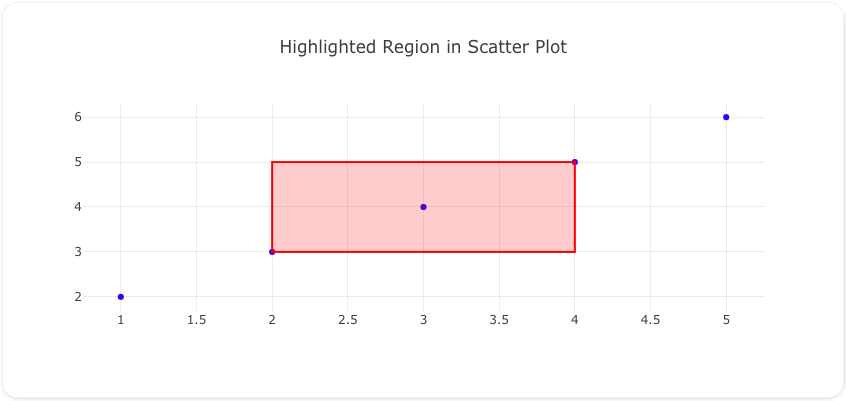
Highlighting regions in your charts helps draw attention to important areas or patterns in your data. You can use shapes like rectangles or circles to emphasize specific time periods, value ranges, or clusters of data points. The transparency of the fill color allows the underlying data to remain visible while still clearly marking the region of interest.
This example shows how to highlight a specific region in a scatter plot using a rectangle shape.
Code
models:
  - name: scatter_data
    args:
      - echo
      - |
        x,y
        1,2
        2,3
        3,4
        4,5
        5,6

traces:
  - name: scatter_trace
    model: ${ref(scatter_data)}
    props:
      type: scatter
      x: ?{x}
      y: ?{y}
      mode: markers
      marker:
        color: blue

charts:
  - name: scatter_with_rectangle
    traces:
      - ${ref(scatter_trace)}
    layout:
      title: Highlighted Region in Scatter Plot
      shapes:
        - type: rect
          x0: 2
          x1: 4
          y0: 3
          y1: 5
          line:
            color: rgba(255, 0, 0, 1)
            width: 2
          fillcolor: rgba(255, 0, 0, 0.2)
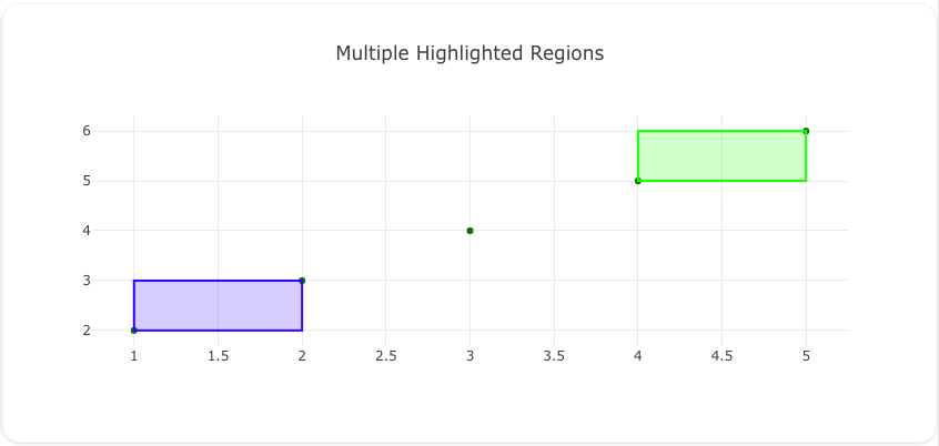
This example demonstrates how to mark multiple regions on a scatter plot using rectangles.
Code
models:
  - name: scatter_data
    args:
      - echo
      - |
        x,y
        1,2
        2,3
        3,4
        4,5
        5,6

traces:
  - name: scatter_trace
    model: ${ref(scatter_data)}
    props:
      type: scatter
      x: ?{x}
      y: ?{y}
      mode: markers
      marker:
        color: green

charts:
  - name: scatter_with_multiple_regions
    traces:
      - ${ref(scatter_trace)}
    layout:
      title: Multiple Highlighted Regions
      shapes:
        - type: rect
          x0: 1
          x1: 2
          y0: 2
          y1: 3
          line:
            color: rgba(0, 0, 255, 1)
            width: 2
          fillcolor: rgba(0, 0, 255, 0.2)
        - type: rect
          x0: 4
          x1: 5
          y0: 5
          y1: 6
          line:
            color: rgba(0, 255, 0, 1)
            width: 2
          fillcolor: rgba(0, 255, 0, 0.2)
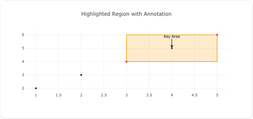
This example shows how to combine a rectangle shape with an annotation to explain its significance.
Code
models:
  - name: scatter_data
    args:
      - echo
      - |
        x,y
        1,2
        2,3
        3,4
        4,5
        5,6

traces:
  - name: scatter_trace
    model: ${ref(scatter_data)}
    props:
      type: scatter
      x: ?{x}
      y: ?{y}
      mode: markers
      marker:
        color: purple

charts:
  - name: scatter_with_region_annotation
    traces:
      - ${ref(scatter_trace)}
    layout:
      title: Highlighted Region with Annotation
      shapes:
        - type: rect
          x0: 3
          x1: 5
          y0: 4
          y1: 6
          line:
            color: rgba(255, 165, 0, 1)
            width: 2
          fillcolor: rgba(255, 165, 0, 0.2)
      annotations:
        - x: 4
          y: 5
          text: "Key Area"
          showarrow: true
          arrowhead: 2
          ax: 0
          ay: -40
          font:
            size: 12
            color: black
Adding Thresholds and Limits
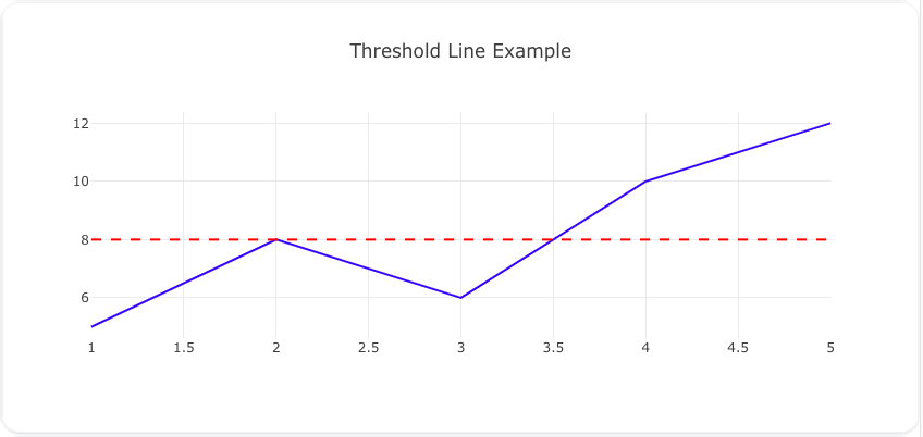
Thresholds and limits are powerful tools for tracking goals, targets, and critical boundaries in your data visualizations. They help viewers quickly identify when values cross important thresholds and provide visual context for performance metrics.
Add a horizontal threshold line to indicate a limit on the y-axis.
Code
models:
  - name: line_data
    args:
      - echo
      - |
        x,y
        1,5
        2,8
        3,6
        4,10
        5,12

traces:
  - name: line_trace
    model: ${ref(line_data)}
    props:
      type: scatter
      x: ?{x}
      y: ?{y}
      mode: lines
      line:
        color: blue

charts:
  - name: line_with_threshold
    traces:
      - ${ref(line_trace)}
    layout:
      title: Threshold Line Example
      shapes:
        - type: line
          x0: 1
          x1: 5
          y0: 8
          y1: 8
          line:
            color: red
            width: 2
            dash: dash
Add a vertical line for x-axis thresholds.
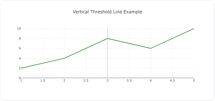
Code
models:
  - name: vertical_threshold_data
    args:
      - echo
      - |
        x,y
        1,2
        2,4
        3,8
        4,6
        5,10

traces:
  - name: vertical_line_trace
    model: ${ref(vertical_threshold_data)}
    props:
      type: scatter
      x: ?{x}
      y: ?{y}
      mode: lines
      line:
        color: green

charts:
  - name: vertical_line_threshold
    traces:
      - ${ref(vertical_line_trace)}
    layout:
      title: Vertical Threshold Line Example
      shapes:
        - type: line
          x0: 3
          x1: 3
          y0: 0
          y1: 10
          line:
            color: orange
            width: 2
            dash: dot
Combine threshold line with annotation for explanation.
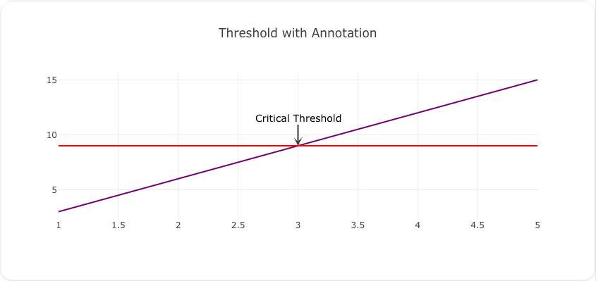
Code
models:
  - name: threshold_annotation_data
    args:
      - echo
      - |
        x,y
        1,3
        2,6
        3,9
        4,12
        5,15

traces:
  - name: threshold_annotation_trace
    model: ${ref(threshold_annotation_data)}
    props:
      type: scatter
      x: ?{x}
      y: ?{y}
      mode: lines
      line:
        color: purple

charts:
  - name: threshold_with_annotation
    traces:
      - ${ref(threshold_annotation_trace)}
    layout:
      title: Threshold with Annotation
      shapes:
        - type: line
          x0: 1
          x1: 5
          y0: 9
          y1: 9
          line:
            color: red
            width: 2
            dash: solid
      annotations:
        - x: 3
          y: 9
          text: "Critical Threshold"
          showarrow: true
          arrowhead: 3
          ax: 0
          ay: -40
          font:
            size: 14
            color: black
Annotating Key Points
Key points are data points that are particularly important or noteworthy. Annotating these points helps viewers understand the significance of specific data points and draw attention to them.
Annotate multiple outliers or key points.
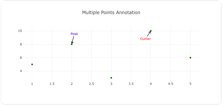
Code
models:
  - name: multiple_points_data
    args:
      - echo
      - |
        x,y
        1,5
        2,8
        3,3
        4,10
        5,6

traces:
  - name: multiple_points_trace
    model: ${ref(multiple_points_data)}
    props:
      type: scatter
      x: ?{x}
      y: ?{y}
      mode: markers
      marker:
        color: green

charts:
  - name: multiple_points_annotation
    traces:
      - ${ref(multiple_points_trace)}
    layout:
      title: Multiple Points Annotation
      annotations:
        - x: 2
          y: 8
          text: "Peak"
          showarrow: true
          arrowhead: 2
          ax: 10
          ay: -40
          font:
            size: 12
            color: blue
        - x: 4
          y: 10
          text: "Outlier"
          showarrow: true
          arrowhead: 3
          ax: -20
          ay: 30
          font:
            size: 12
            color: red
Combine point annotation with region highlighting.
Code
models:
  - name: point_region_data
    args:
      - echo
      - |
        x,y
        1,3
        2,6
        3,9
        4,12
        5,15

traces:
  - name: point_region_trace
    model: ${ref(point_region_data)}
    props:
      type: scatter
      x: ?{x}
      y: ?{y}
      mode: markers
      marker:
        color: purple

charts:
  - name: point_with_region
    traces:
      - ${ref(point_region_trace)}
    layout:
      title: Point with Region
      shapes:
        - type: rect
          x0: 2
          x1: 4
          y0: 6
          y1: 12
          line:
            color: rgba(255, 165, 0, 1)
            width: 2
          fillcolor: rgba(255, 165, 0, 0.2)
      annotations:
        - x: 3
          y: 9
          text: "Important Area"
          showarrow: true
          arrowhead: 2
          ax: 0
          ay: -50
          font:
            size: 14
            color: black
Emoji Hover Text
Emoji annotations are a creative way to add small, non-intrusive icons to your charts. By using hover effects, they can provide additional context or explanations without overcrowding the visualization. This section demonstrates how to implement emoji annotations effectively in Visivo.
Best Practices
- Keep emoji usage relevant and avoid overloading the chart.
- Use hover effects for additional context to avoid clutter.
- Choose emojis that clearly communicate the intended meaning.
Below are three examples showcasing the use of emoji annotations.
This example shows how to annotate specific data points with emojis.
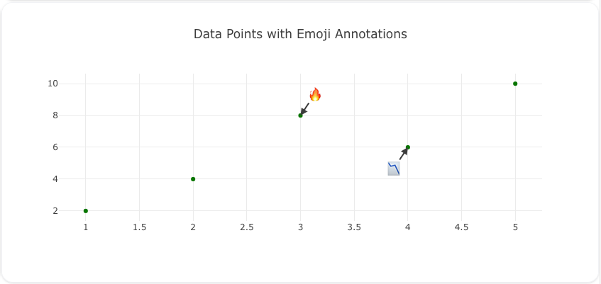
Code
models:
  - name: emoji_data
    args:
      - echo
      - |
        x,y
        1,2
        2,4
        3,8
        4,6
        5,10

traces:
  - name: emoji_trace
    model: ${ref(emoji_data)}
    props:
      type: scatter
      x: ?{x}
      y: ?{y}
      mode: markers
      marker:
        color: green

charts:
  - name: emoji_annotations_chart
    traces:
      - ${ref(emoji_trace)}
    layout:
      title: Emoji Annotations for Data Points
      annotations:
        - x: 3
          y: 8
          text: "🔥"
          showarrow: true
          arrowhead: 3
          ax: 0
          ay: -30
          hovertext: "This is the peak value"
          font:
            size: 16
        - x: 5
          y: 10
          text: "🎯"
          showarrow: true
          arrowhead: 3
          ax: 0
          ay: -40
          hovertext: "Target achieved!"
          font:
            size: 16
Combine emojis with threshold lines for better visualization.
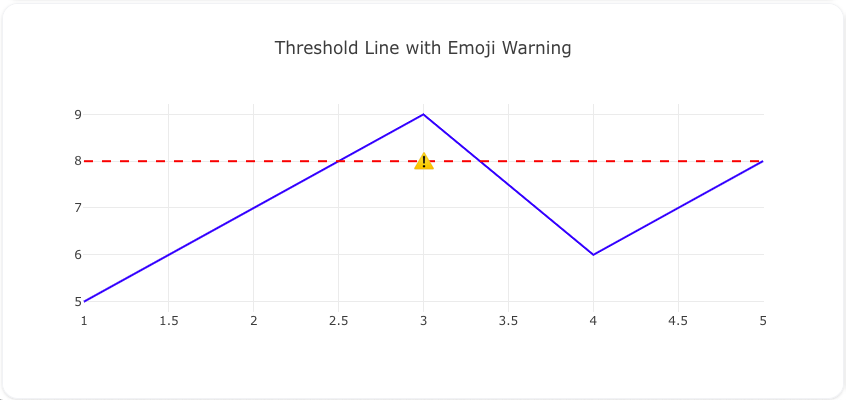
Code
models:
  - name: threshold_emoji_data
    args:
      - echo
      - |
        x,y
        1,5
        2,8
        3,6
        4,10
        5,12

traces:
  - name: threshold_emoji_trace
    model: ${ref(threshold_emoji_data)}
    props:
      type: scatter
      x: ?{x}
      y: ?{y}
      mode: lines
      line:
        color: blue

charts:
  - name: threshold_with_emojis
    traces:
      - ${ref(threshold_emoji_trace)}
    layout:
      title: Threshold Line with Emojis
      shapes:
        - type: line
          x0: 1
          x1: 5
          y0: 8
          y1: 8
          line:
            color: red
            width: 2
            dash: dash
      annotations:
        - x: 3
          y: 8
          text: "⚠️"
          showarrow: false
          hovertext: "Warning: Threshold crossed"
          font:
            size: 16
Use emojis to annotate regions of interest.
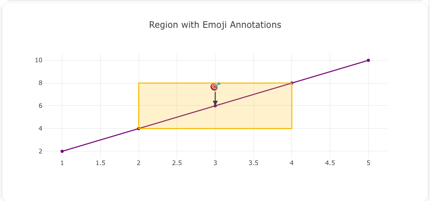
Code
models:
  - name: region_emoji_data
    args:
      - echo
      - |
        x,y
        1,2
        2,4
        3,6
        4,8
        5,10

traces:
  - name: region_emoji_trace
    model: ${ref(region_emoji_data)}
    props:
      type: scatter
      x: ?{x}
      y: ?{y}
      mode: markers
      marker:
        color: orange

charts:
  - name: region_with_emojis
    traces:
      - ${ref(region_emoji_trace)}
    layout:
      title: Region Highlighted with Emojis
      shapes:
        - type: rect
          x0: 2
          x1: 4
          y0: 4
          y1: 8
          line:
            color: rgba(0, 0, 255, 1)
            width: 2
          fillcolor: rgba(0, 0, 255, 0.2)
      annotations:
        - x: 3
          y: 6
          text: "💡"
          showarrow: false
          hovertext: "Interesting data here"
          font:
            size: 16
With these examples, you can creatively use emoji annotations to make your charts more engaging and informative.
Best Practices
Colors and Styling
- Use consistent colors throughout your visualizations for better readability
- Choose contrasting colors between shapes/annotations and the underlying data
- Consider color-blind friendly palettes when selecting colors
- Use semi-transparent fill colors for shapes to avoid obscuring data points
- Maintain consistent font styles and sizes across annotations
Layout and Positioning
- Position annotations to minimize overlap with data points
- Use arrow positions strategically to point to exact features
- Leave adequate whitespace around annotations for readability
- Consider the chart's aspect ratio when placing shapes and annotations
Content and Clarity
- Write clear, concise annotation text that adds meaningful context
- Avoid excessive use of shapes/annotations to prevent visual clutter
- Ensure all shapes and annotations serve a specific purpose
- Use hover text for additional details rather than cramming text into annotations
- Group related annotations visually when possible
Technical Considerations
- Test annotations at different screen sizes to ensure readability
- Verify that shapes scale appropriately with zoom levels
- Consider using templates for consistent annotation styling
- Document any custom annotation styles in your configuration
With these examples and best practices, you can explore the full power of shapes and annotations in Visivo while creating clear and effective visualizations.


